Driving excellence and efficiency in healthcare

Founded by two aeronautical engineers, MEDFAR began with a simple insight: healthcare systems were weighed down by complexity. The company set out to apply engineering thinking to clinical workflows, creating technology that helps providers deliver better care with less friction. As MEDFAR expanded internationally, its decade-old brand no longer reflected its innovation, engineering roots, or global ambitions. What began as a brand refresh evolved into a full rebrand.

  • Contribution
  • Brand Identity
  • Strategy
  • Art Direction
  • Campaign Design
  • Spacial Branding
White stylized text spelling MEDFAR on a blue gradient background.
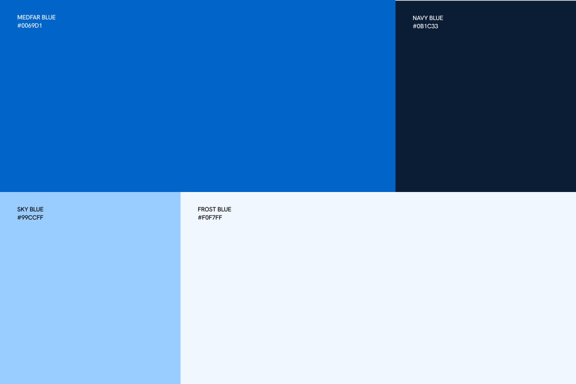
Color palette with four blue shades: Medfar Blue (#0069D1), Navy Blue (#0B1C33), Sky Blue (#99CCFF), and Frost Blue (#F0F7FF).
Blue stylized capital letters 'ME' on a dark blue gradient background with light grid lines.
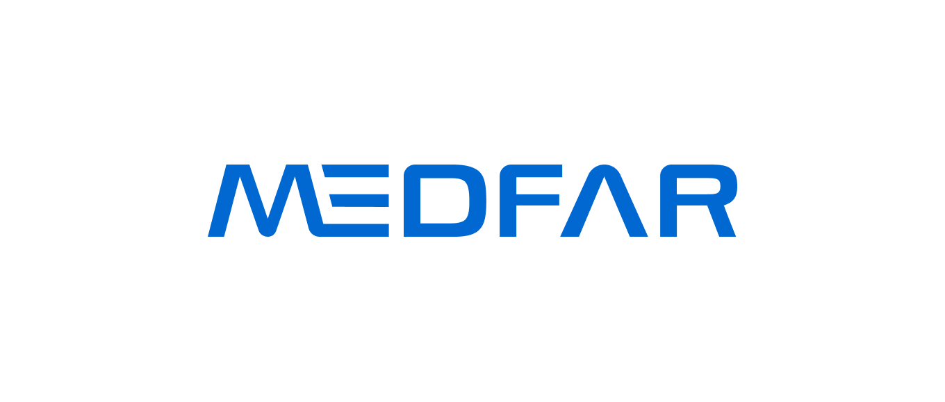
Blue circular logo with stylized white and blue letters forming an M inside two concentric circles, with the text MEDFAR Clinical Solutions below.MEDFAR logo in bold blue capital letters with stylized E consisting of horizontal lines.
Before
After
MedFar Clinical Solutions logo featuring a stylized letter M inside two concentric blue circles on a light background.MEDFAR in blue stylized uppercase letters on a white background.
Before
After
Challenge

The existing identity was difficult to scale: the logo lacked legibility at small sizes, emphasized the symbol over the company name, and required translation across markets. Leadership also felt it no longer represented the company’s innovation or engineering-driven culture.
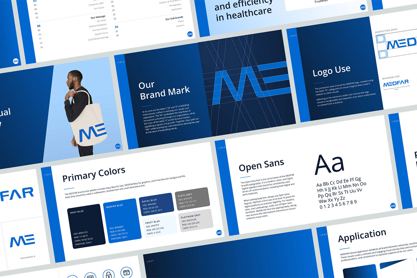
A collage of graphic design brand guideline pages for MEDFAR, featuring the logo 'ME' in blue, brand colors including Navy Blue, Medfar Blue, Royal Blue, Slate Grey, Frost Blue, and Platinum Grey, a sample tote bag with the logo, typography details showing the Open Sans font, and instructions on logo use and brand application.
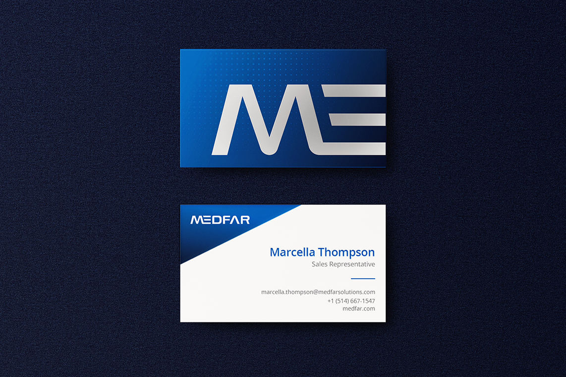
Two business cards on a dark textured background; the top card has a blue gradient with a large silver stylized 'ME' logo, the bottom card is white with a blue corner showing 'MEDFAR' logo, and contact details for Marcella Thompson, Sales Representative, including email, phone number, and website.
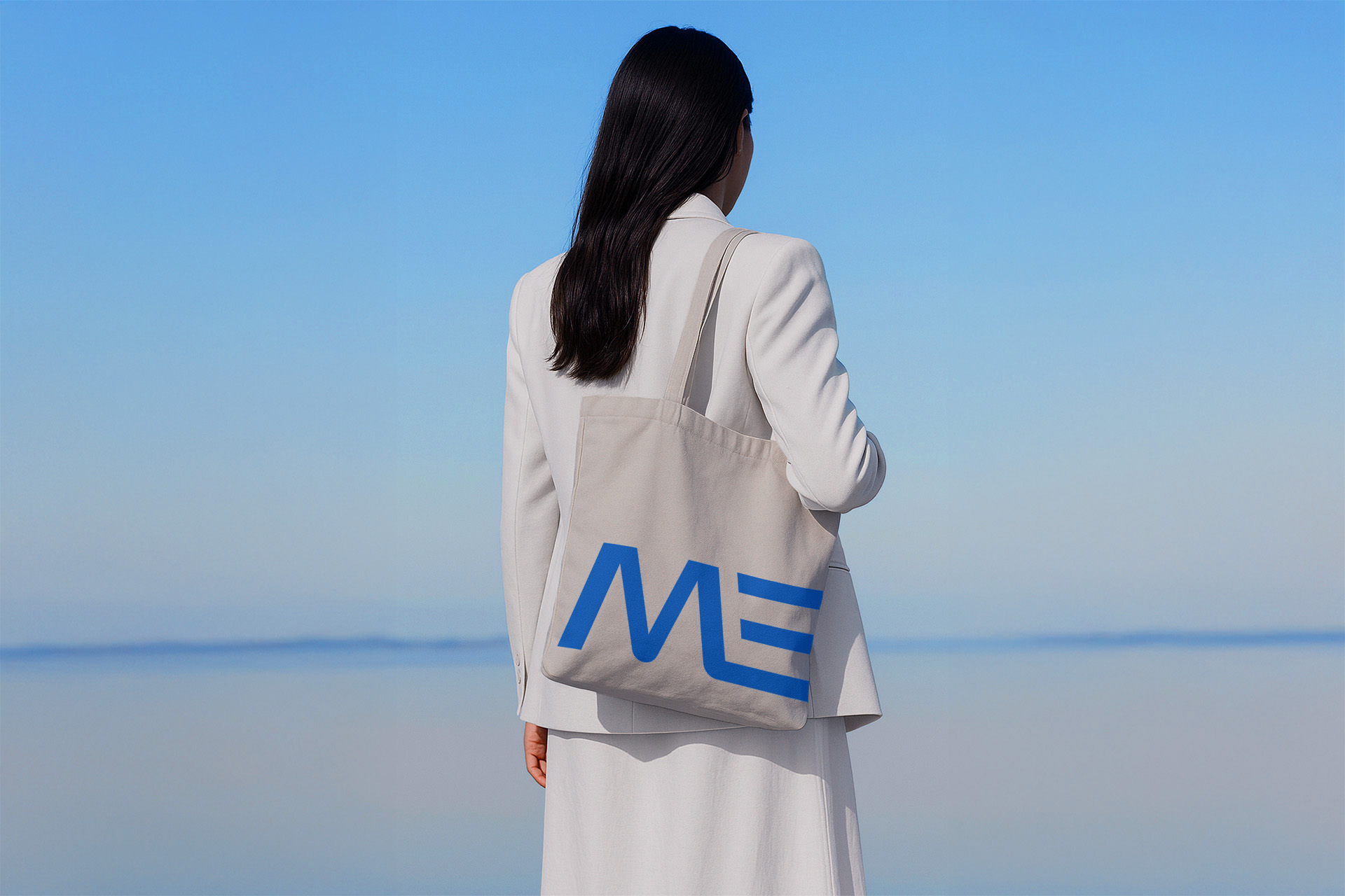
Woman dressed in a white blazer and skirt standing with her back to the camera, holding a beige tote bag with a blue stylized logo against a calm blue sky and water background.
Approach

I led research across healthcare competitors and adjacent industries, balancing current design trends with the need for longevity and user trust. With clinicians as a core audience, the system needed to feel modern without disrupting familiarity.

Guiding principles: innovation, clarity, and ease. Key constraints included maintaining brand recognition (blue palette, all-caps MEDFAR) and creating a scalable wordmark and symbol system for digital, physical, and product environments.
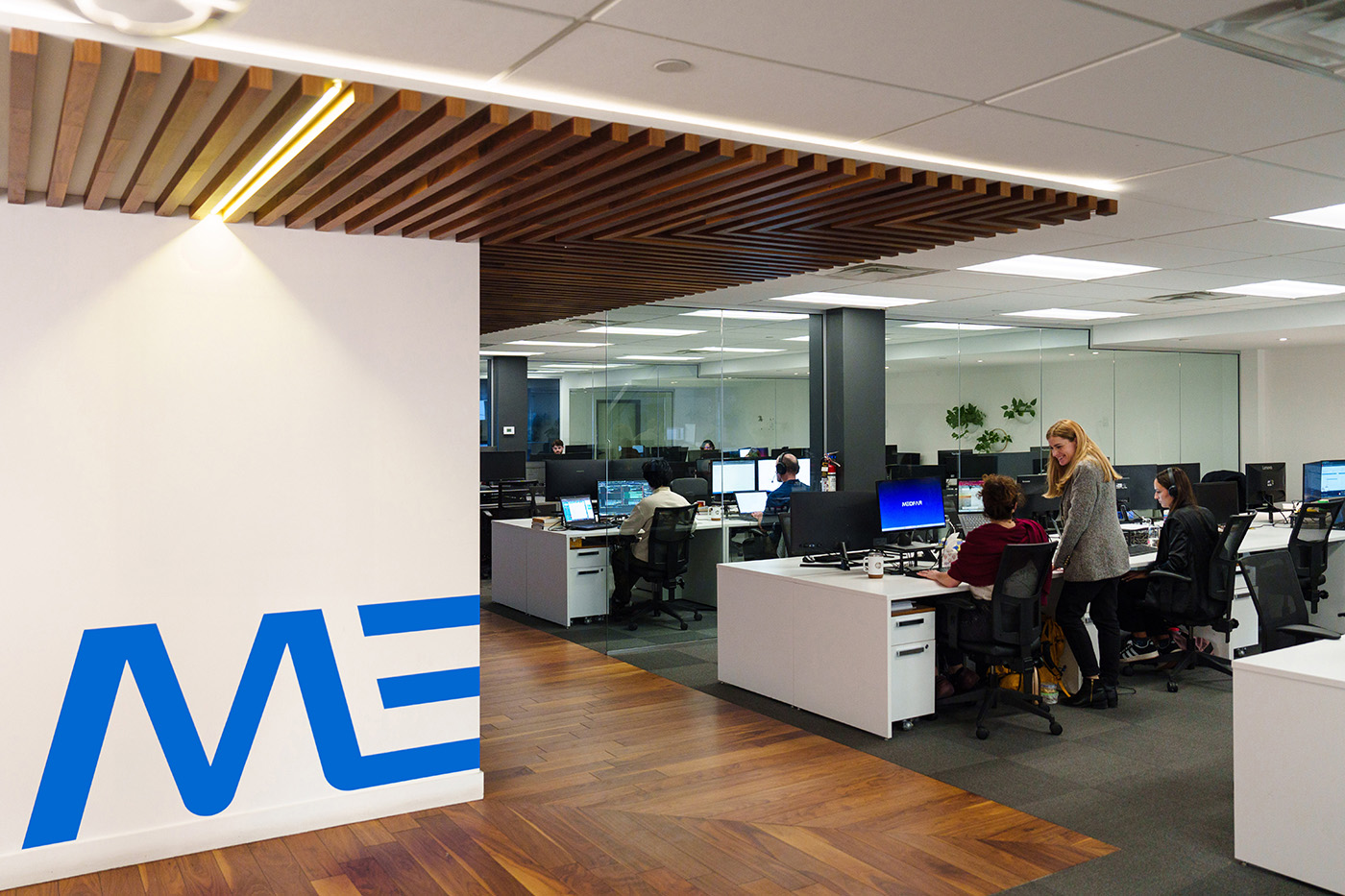
Modern office space with wooden floor, white desks, and glass partitions; several people working at computers; one woman standing and talking to a seated colleague.
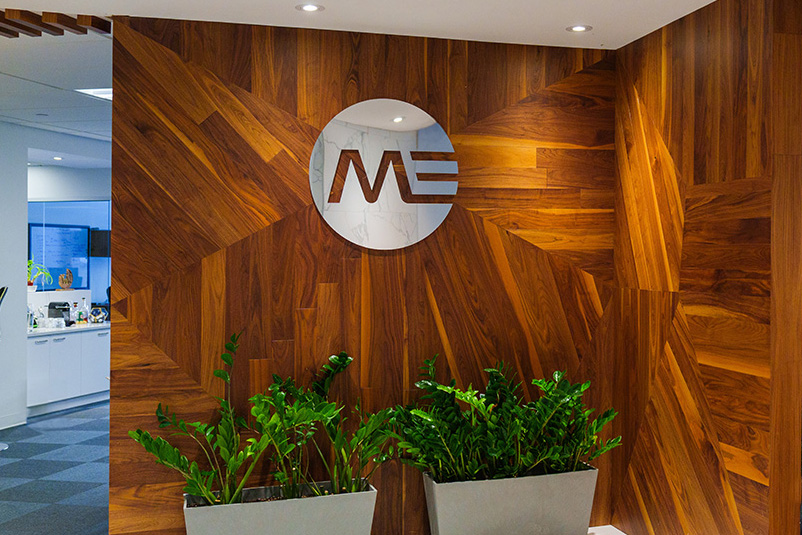
Indoor office area with a wood-paneled wall featuring a circular logo with the letters M and E, and two white rectangular planters filled with green leafy plants in front.
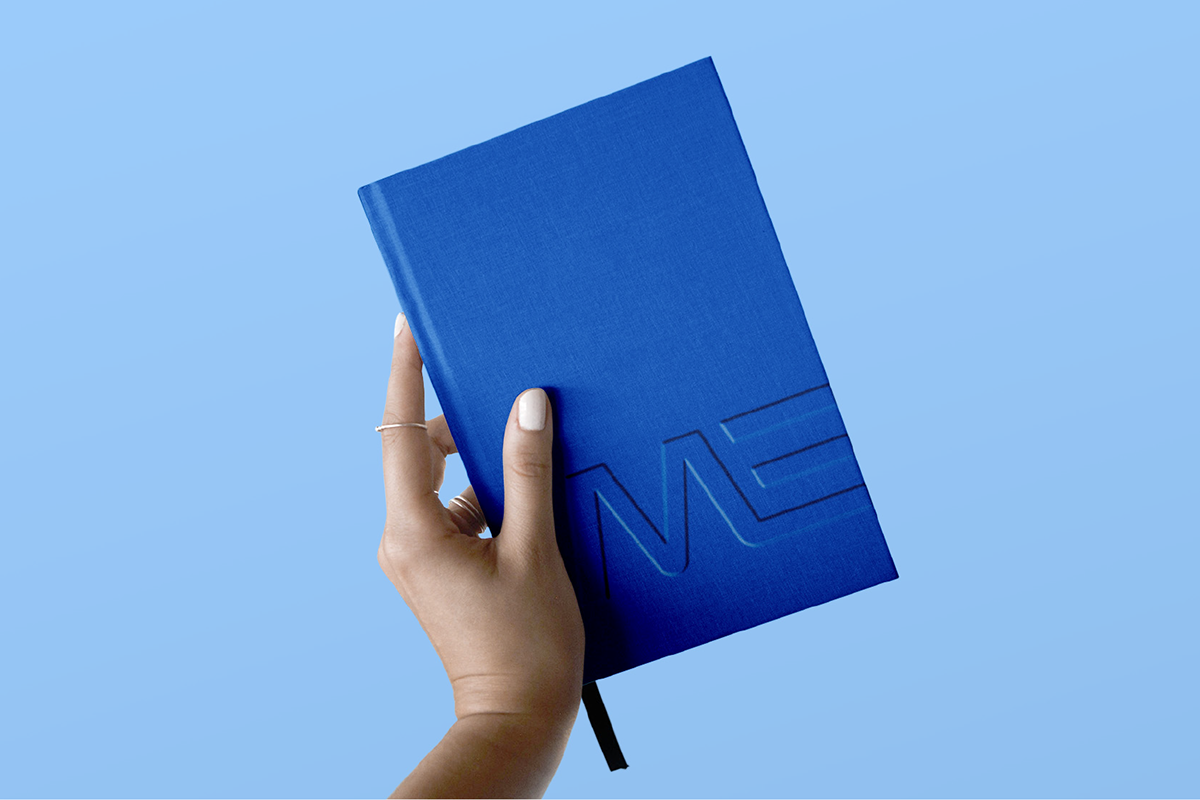
A hand with white nail polish and rings holding a closed blue notebook embossed with the letters 'ME' on a light blue background.
Launch & Implementation

The identity launched internally through a company-wide reveal and brand film, then publicly at Canada’s largest healthcare conference with a new booth, event activation, social rollout, and press release. I led implementation across digital, print, and built environments to ensure consistency across every client touchpoint.

Three smartphone screens showing MEDFAR healthcare platform: first screen with two doctors walking in a hallway and text about integrated care platform for doctors, care teams, and patients; second screen showing a hand pointing at a tablet screen with healthcare software and text about driving excellence and efficiency; third screen showing hands typing on a keyboard in front of a computer monitor displaying healthcare software.
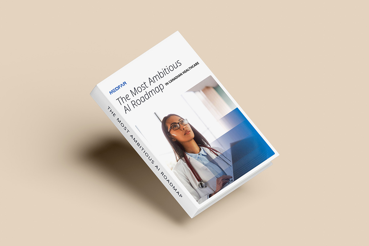
Book titled 'The Most Ambitious AI Roadmap in Canadian Healthcare' by Medfar, featuring a photo of a female doctor wearing glasses and a stethoscope, working on a laptop.
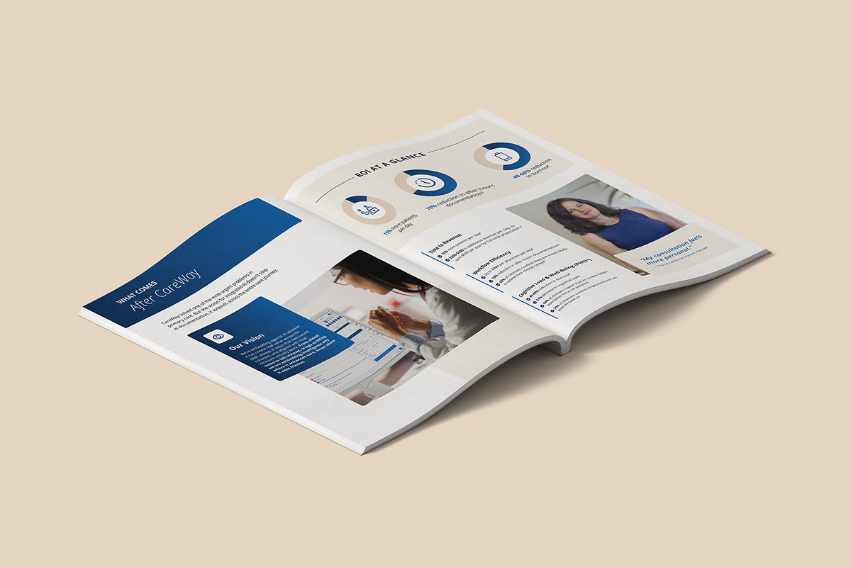
Open magazine spread on a beige surface featuring a section titled 'What comes after CareWay' with an image of a person using a tablet on the left page. The right page contains a 'ROI at a Glance' infographic with three circular charts and a photo of a smiling woman in a blue top with a testimonial quote.
Outcome

The rebrand strengthened MEDFAR’s positioning as an innovative global healthcare technology leader and provided a scalable system adopted across markets and teams. This project shaped how I approach scalable design systems and cross-functional collaboration.

More Work